The Email Builder uses a "What You See Is What You Get" (WYSIWYG) editing principle.
Imagine you're drafting an email, and you decide to bold a sentence, insert an image after a paragraph, or change the color of a heading. As you make these changes in the editor, they are immediately reflected, just as they would appear in the final email. This gives you a real-time preview and a straightforward editing experience, helping you to create better emails more efficiently.
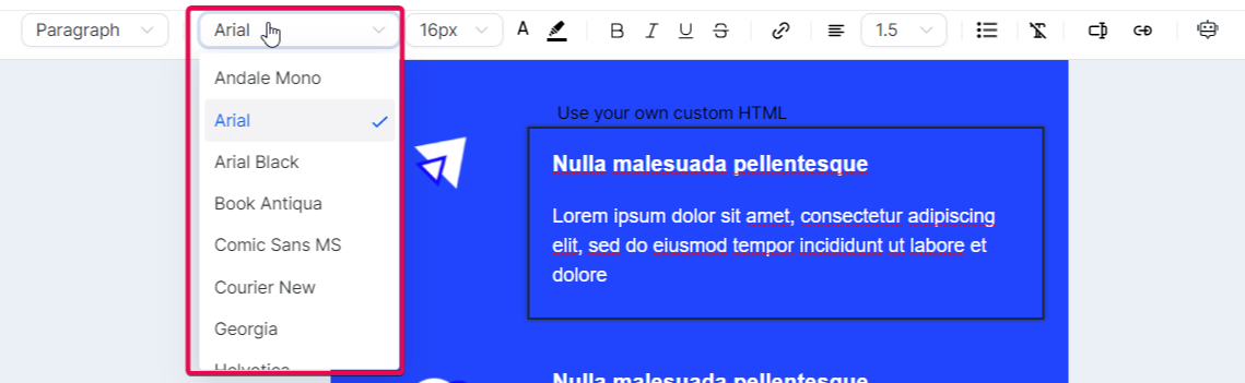
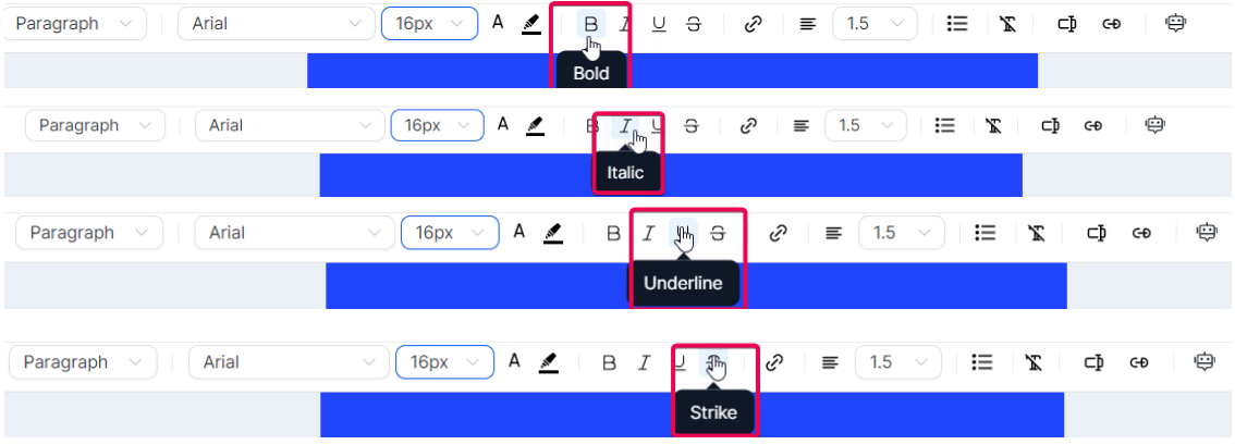
The tool supports various customization features, allowing you to style your email content using multiple headings and paragraph formats. You can choose from a selection of supported fonts, apply different text sizes ranging from 8px to 96px, and color your text using hex code for precise color selection. You can also apply text formatting such as bold, italic, underline, and strikethrough, or add hyperlinks for redirection.

Please Note: To maintain uniformity in the structure of your emails, we have implemented a default padding update. You now can manage the spacing around your content. Please be aware that the default settings for padding are as follows:
Top Padding: 12
Bottom Padding: 12
Left Padding: 24
Right Padding: 24
How to use the Email Builder...
- Navigate to Marketing > Emails > Templates
- Here you can create a new template or edit an existing one.

Upon accessing the Email Builder, you will be greeted by a screen where you see a visual depiction of the email in a large center panel with an Elements panel on the left and an Options panel on the right.
On the top, you will find a toolbar with different functionalities:

- The 'Add Elements' button lets you introduce new content into your email, from text and images to more complex structures.

- The 'Manage Elements' option gives an overview of all elements in your email, allowing you to select and adjust them easily.

Lastly, the 'Appearance' setting lets you control the global style of your email, including things like background color, Divider, Custom CSS styling, and Mobile Formatting.

These functionalities are designed to give you complete control over your email's design, from the individual components to the overall look and feel.
Adding Elements
- Click on the Add Elements tab to drag and drop the Layouts onto the page so you can drop the Element into any existing layout

Layouts

Here's a detailed explanation of each layout:
1: This layout represents a single-column structure. All content is placed in one straight vertical line. This is the most basic and one of the most common layouts used in emails. It's great for readability, especially on smaller screens such as mobile devices.
2: This layout corresponds to a two-column structure. Your email content is divided into two vertical columns. This layout is ideal for displaying two groups of content side by side, like an image and a text block or two articles from an RSS feed.
1/3: 2/3 and 2/3 : 1/3: These layouts represent a structure where the content is divided into two unequal columns. In 1/3: 2/3, one column takes up 1/3 of the width, and the other takes up 2/3. It's reversed in the 2/3: 1/3 layout. These are great for highlighting one piece of content more than the other, like an image and an accompanying description where the image is the main focus.
1/4: 3/4 and 3/4 : 1/4: Similar to the above, but here one column takes up 1/4 of the space, and the other takes up 3/4, and vice versa. This layout is useful when one piece of content is significantly more important than the other, such as a small navigation menu alongside a large content area.
4: This layout refers to a four-column structure. Your email content is split across four equal vertical columns. This is useful for presenting multiple pieces of content of equal importance side by side, like a grid of images or multiple articles from an RSS feed.
These layouts offer various ways to structure and present your content, depending on your specific needs and the type of email you're sending. By understanding the different options, you can choose the most effective layout for your email.
To add any of these elements to your email, drag and drop them onto your canvas. When you select an element for editing, the Inline Editor will pop up, providing numerous options to modify your chosen element to fit your requirements.
Elements

Here is a comprehensive list of content types you can add to your email:
Text: This versatile element can be used for headings, paragraphs, captions, and more. With the inline editor, you can fine-tune every text aspect, from the font style to the color and alignment.

Image: If you want to include photos, graphics, or any other visual content, the Image element is the tool you need. You can upload images directly from your computer or link them from an external source.

Button: Enhance user interaction with the Button element. You can link to a webpage, start a download, or trigger any other click-based action.
Note: Enter the text you want to display on your button. For instance, you might use 'Follow Me' to invite readers to follow a link to your social media page
Divider: The Divider element allows you to introduce clear separations between different sections of your email. Customize the color, width, and style to fit your design.
Social: Want your recipients to visit your social media profiles? The Social element lets you easily include icons linked to various social media platforms.
Footer: Use the Footer element to include essential information like contact details, company address, or unsubscribe links.
Code: Need more advanced features? The Code element allows you to insert custom HTML code directly into your email. This is where you input your custom code. This allows you to create more advanced layouts and components within your email. This option is intended for users who are proficient in HTML.
Video: Engage your recipients with multimedia content. Insert a Video element and link it to your hosted video content.
Shopping Cart: If you're in the e-commerce industry, the Shopping Cart element is a handy tool for including product details, pricing, and direct links to your online store. It's a way to remind them of the products they're interested in and encourage them to finalize their purchases.
RSS Header: The RSS Header block in the email builder is a powerful tool that allows you to dynamically populate the <channel> tags from your RSS Feed in your email campaign.
RSS Items: When dealing with RSS feeds, the "RSS Items" element is a crucial part of an email builder in email marketing platforms. It essentially works as a dynamic content placeholder that populates content from the RSS feed into your email campaign. The RSS items can range from blog posts, news updates, articles, or any published content accessible through an RSS feed.
Managing Text and Formatting
An inline editor is a powerful tool that lets you easily manage text and its formatting. When you highlight any portion of text, a range of options becomes available in the editor.
You can change the heading type.

Select a different font, adjust font size, and modify the text color


Options for bold, italic, underline, and strikethrough are also available
If you wish to add a hyperlink to your text, the inline editor allows you to do so, giving you control over its display text and target URL


You can also adjust text alignment and line height or introduce bullet points to your text.

Using Advanced Editing Options
The inline editor also comes equipped with advanced editing options. The 'Clear Format' feature lets you strip any existing formatting from a section of the text, a handy tool when pasting text from external sources.

Custom values: They bring a personalized touch to your emails by incorporating specific recipient details such as their name or location. This personalization can improve your email's relevance to each recipient, thereby improving engagement rates.

Trigger links: They allow recipients to perform certain actions directly from the email, such as confirming a subscription, unsubscribing, or accessing a special offer. These interactive elements can drive engagement and boost conversions by simplifying user actions.

Managing Elements
The 'Manage Elements' function gives you control over each element within your email. Selecting an element in this section allows you to modify its visibility for different devices - desktop, mobile, or both.

Visibility settings allow you to control how certain elements appear on different devices. Specifically, "mobile visibility" and "desktop visibility" settings allow you to choose which elements of your email or webpage should be displayed when viewed on a desktop or mobile device.
Mobile Visibility refers to how your email or webpage elements appear on mobile devices like smartphones or tablets. Given the smaller screen sizes of these devices, you might opt to hide certain elements that don't display well or simplify your content for easier mobile consumption. It can also involve restructuring or resizing elements for a more mobile-friendly layout.

Desktop Visibility refers to how your email or webpage elements are viewed on desktop devices. Since desktop screens are larger and provide more space, you can include additional elements that wouldn't fit well on a mobile screen. Also, elements that require hover actions, which are not applicable on mobile devices, can be displayed.

Moreover, each element can be edited independently, allowing you to change its properties.

You can remove an element from the 'Manage Elements' section if it doesn't fit into your email.

Whenever you hover over and click a section, column, or element in the Manage Elements section, the screen scrolls to the section, column, or element you are hovering your cursor over.

Adjusting Appearance and Styling
The 'Appearance' function is your go-to place for tweaking your template's look and feel.

Template
Here you can choose the color scheme for your template, upload a background image, and even define the width of your email's content.
Button:
The "Button" section in the appearance settings allows you to design and stylize action-oriented buttons for interactive and engaging emails.
Divider:
The "Divider" section in the appearance settings lets you incorporate customized lines for structuring and segregating email content.
Custom CSS:
The "Custom CSS" section allows you to add CSS styles to customize your email layout further. However, this requires a good understanding of CSS and its implications in email design. CSS in emails works slightly differently than in web design due to the variety of email clients and their rendering capabilities.
Again, this is a feature that is intended for experienced web developers.